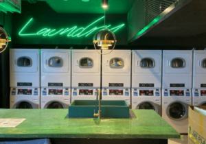
We’re excited to announce today that Aqualogic has a new look!
Aqualogic has refreshed its iconic logo and brand identity. The brand update is a move to more closely reflect the company’s culture and values, as we continue to move towards delivering an even better laundry experience for our customers across our core products and services.
![]()
Although a bold move to update a logo that has barely been altered since its inception over 20 years ago, now is the right time for a refresh. Our new logo and brand identity encapsulate the company’s direction as well as its history. The new icon element takes inspiration from the existing logo and maintains symbolism of who we are and what we strive for.
You may have also recognised this symbolism – Aqua, which is represented in the water drop to embody notions of refreshing, uplifting, creative, calming, light-hearted, and balanced. Logic is represented by the mountain-like design, and takes on meanings of progression, experience, growth, innovation, and unlocking potential.
Together with the modern word mark, the logo captures the people centric spirit and progressive aspirations of the Aqualogic brand. Products will come and go and technologies change over time, but the renewed brand will continue to carry the company’s legacy into a successful future.
Starting today, you’ll see these exciting changes, and gradually over the next month as we endeavour to update all our systems and documentation. This marks a new chapter in our ongoing mission to unlock the potential of every laundry. Thank you to all of our customers for inspiring this brazen change!